Projects

Arcadia 2022
Creating the identity for a festival called Arcadia: 100 days of culture in Leeuwarden and Fryslân. Art Direction & Graphic Design for this project at @bwhontwerpers.

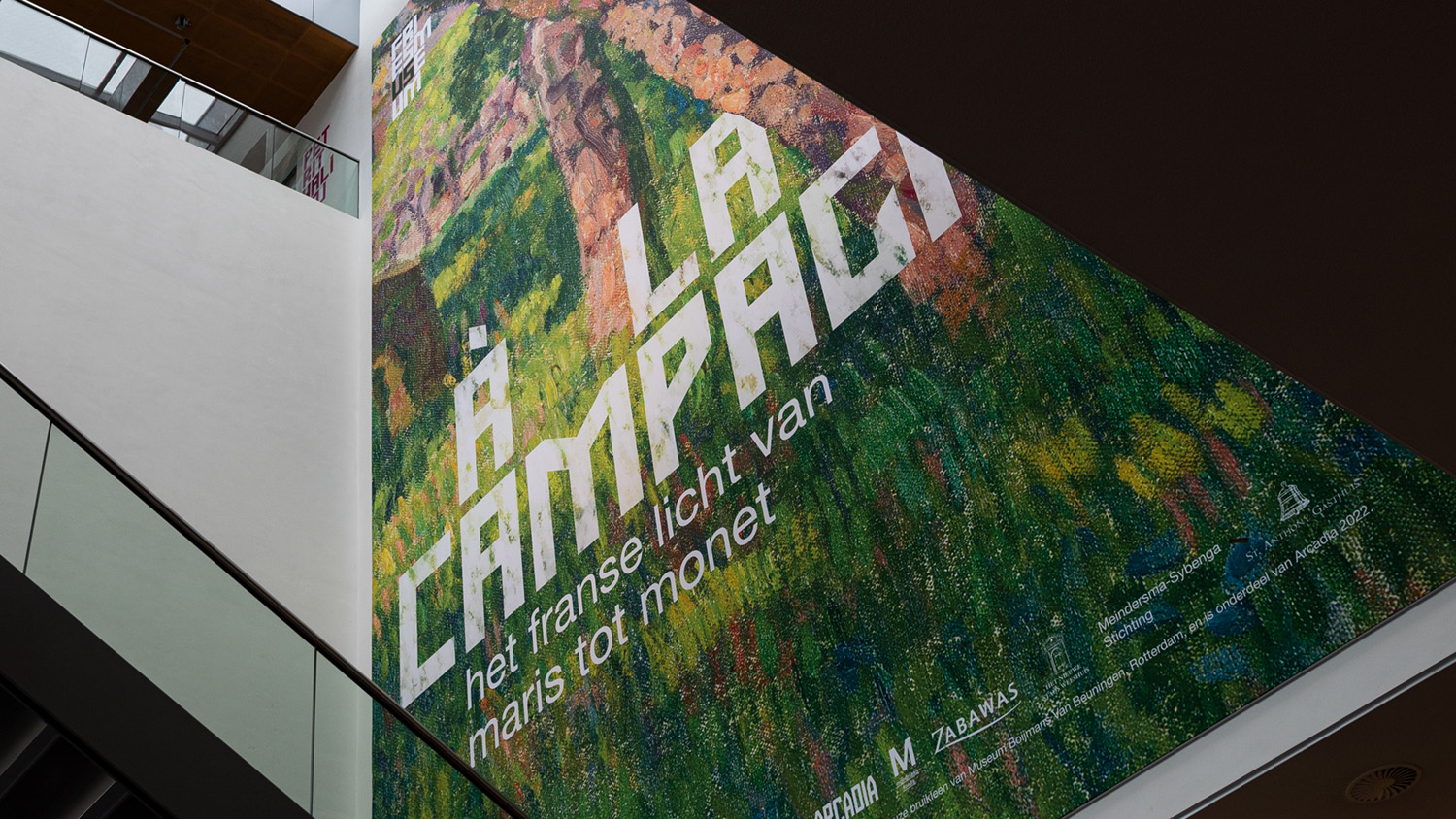
Fries Museum
Creating all sorts of bespoke graphic resources for Fries Museum. Art Direction & Graphic Design for this project at @bwhontwerpers.

Paradys
Identity and Graphic Design for an art exhibition in Oranjewoud during a cultural festival called Arcadia 2022. Art Direction & Graphic Design for this project at @bwhontwerpers.

De Utrecht Leeuwarden
Identity, books and exhibitions for a 1904 Jugendstil cultural exhibition centre. Art Direction & Graphic Design for this project at @bwhontwerpers.

Fries Museum
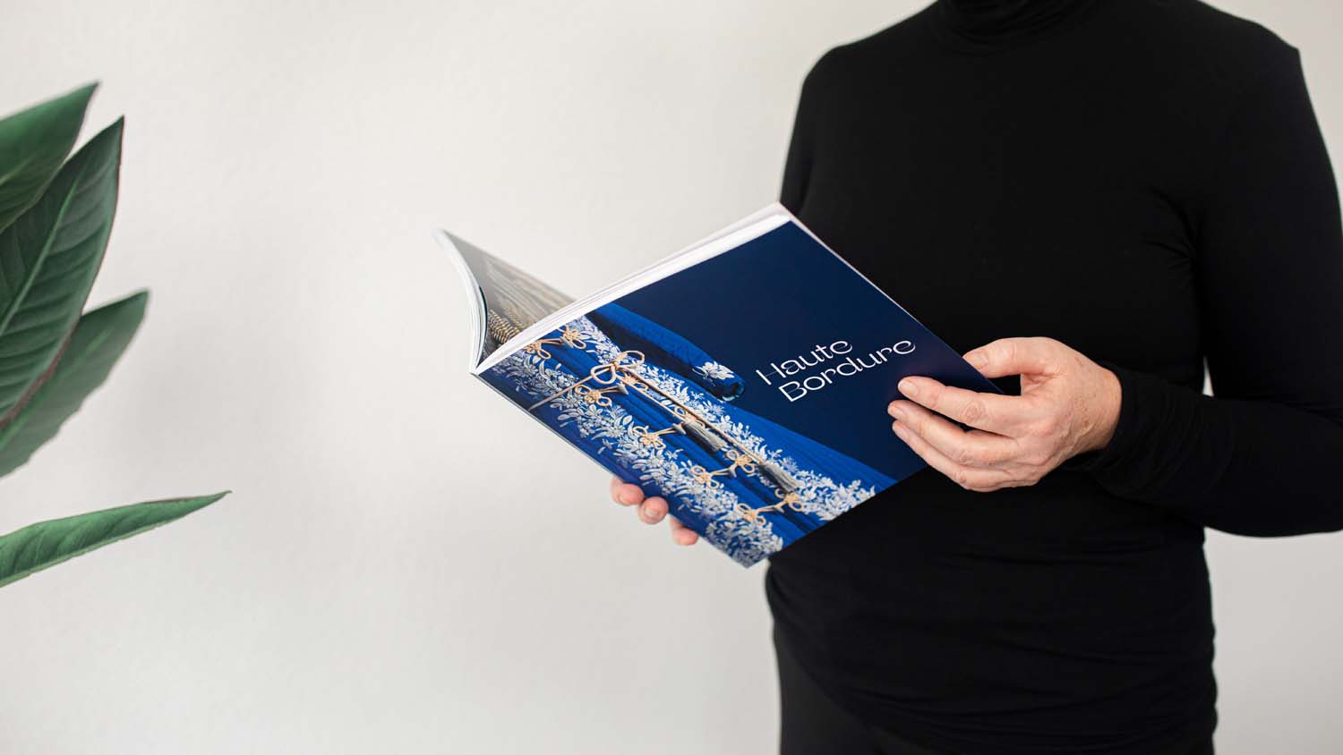
Haute Bordure
Book/editorial design about the long tradition of embroidery in fashion. The accompanying catalog for the exhibition Haute Bordure at the Fries Museum in 2021. Art Direction and Graphic Design at @bwhontwerpers, published by Waanders Uitgevers.
MyWheels
Campaigning for a carsharing service. Offline and Online. Art Direction & Graphic Design for this project at @bwhontwerpers. Photography by @woutervanderlinde.
Noord Nederlands Orkest
Rebranding the oldest professional symphonic orchestra in The Netherlands (1862). Art Direction & Graphic Design with a seasonal illustrator at @bwhontwerpers. Visuals from 2018/2019 in collaboration with @rikoostenbroek.
Fortuna Vlieland ↱
Art Direction, Graphic Design and Web Development for a newly launched beer brewery on the island Vlieland (The Netherlands). An project at @bwhontwerpers. Video by @marleenannema and @tomvanhuisstede.

11fountains ↱
11 fountains created by 11 internationally known artists like Jaume Plensa, Lucy & Jorge Orta, Johan Creten and more from all over the world. Art Direction, Graphic Design and Web Development for this project at @bwhontwerpers. Illustrations by Nick Liefhebber.

Mijndomein
Providing domains and (shared) hosting, recently adding shared car lease and solar panels, Mijndomein aims to make difficult things easy and affordable for everyone. A project with Art Direction, Graphic Design and Web Development at @bwhontwerpers.
Visit Leeuwarden
A beautiful city in Friesland. Former Capital of Culture in 2018 - Leeuwarden rebranded to Visit Leeuwarden. A project with Art Direction, Graphic Design at @bwhontwerpers. Animation by @dirkjan.co.
Noord Nederlands Toneel ↱
Making theater productions that are relevant to a broad and contemporary audience, in collaboration with Club Guy & Roni. Together they're an interdisciplinary theater house called NITE. A Web Design & Development project at @bwhontwerpers, in collaboration with @halie.nl.

Fries Museum
We Vikings
Book/editorial design about Frisians and Vikings in the coastal area of the low countries. The accompanying catalog for the exhibition We Vikings at the Fries Museum in 2019/2020. Art Direction and Graphic Design at @bwhontwerpers, published by Waanders Uitgevers.
Welcome to The Village ↱
An experimental pop festival and winner of the prestigious EFFE-award for artistic excellence. A project with seasonal illustrators for all sorts of communication. Art Direction, Graphic Design and Web Development at @bwhontwerpers.
Tesla Taxi Service ↱
Art Direction, Graphic Design and Web Development for Tesla Taxi Service in Switzerland. Photography in collaboration with @paolodecaro

Marboei
An experience at OBE (Leeuwarden), a stage for literature, art and language. Thirteen poets writing about thirteen breath-taking destinations on the water in Friesland. Art Direction and Graphic Design of this experience/exhibition at @bwhontwerpers.

Cinetree
A platform with beautiful handpicked movies and documentaries. Graphic and Web Design of several campaigns in collaboration with @fabian.hijlkema.
Deepgrooves ↱
A vinyl pressing plant located in a former jail. Building a configurator with 6418 options. Identity and Web Development at @bwhontwerpers.

Keramiekmuseum Princessehof
Sunken Treasures
Book/editorial design about long lost treasures at sea. The accompanying catalog for the exhibition Sunken Treasures at the Keramiekmuseum Princessenhof in 2019/2020. Art Direction and Graphic Design at @bwhontwerpers, published by Waanders Uitgevers.
Leeuwarden-Fryslân 2018
Leeuwarden, Capital of Culture in 2018. Art Direction and Graphic Design varying from several publications to city dressing at @bwhontwerpers. Above a .gif of an invitation for the King & Queen.

TEAMLTD
Identity for a Canadian lifestyle brand with a community in pursuit of the extraordinary.

Vredeman de Vries
Prijs voor de Vormgeving
Had the honor to design the publication for the design award/prize of Friesland (province of The Netherlands), showing all nominees and winners from 2001 to 2017.